Showing posts with label character. Show all posts
Thursday, August 1, 2013
Batman Beyond part 2
So here is the next piece; I want so badly to call this finished, but I know it's not, especially since I'm lacking the belt. Once I get a bit of a head start on this game project I'm working on I'll come back to this and tweak it - add the belt, rework the chest symbol, tweak the helmet, add a batarang, and possibly add a background. For now I can only hope the lighting is sufficient since that was the main thing I wanted to accomplish. I hope you all enjoy the current state-my Photoshop skills are improving every day, so stay tuned to see more awesomeness. Vaya con Dios.
Wednesday, July 31, 2013
Batman Beyond part 1
So I FINALLY got my account to allow me to upload images - I have no idea what happened to it. Anyway, no need to dwell on it-I'm back in action and ready to start posting again. my first is a Batman piece I decided to do digitally since I know my skills need improving. I rendered a pose using DAZ 3D, then saved a jpeg and referenced off of it. I wanted the lighting to be a bit direct in order to show the muscle tone of of the figure (as this is a skintight mesh suit). I also wanted some harsh highlights as the Beyond universe is pretty lit up. The only thing that is pretty distinct from the original design is the biker-esque helmet and visor and the detached wings. A part 2 is coming soon-it will show a darker suit and "radiating" features. For now, please enjoy this sketch-by-painting image, and please comment below. Vaya con Dios.
Friday, April 5, 2013
Sweet Lolita Concept part 1
Here is a quick digital sketch of a Lolita character I'm currently working on. I know there is much that has yet to be done, but as of this very moment, I'm pleased with where it stands; the ideas that are swimming in my head are so numerous that it's like a school of fish-so many, in fact, that I'll unfortunately be unable to incorporate them all. The basic look I'm aiming for with her is a Sweet Lolita with a touch or two of some Gothic elements (to pay tribute to the model I'm referencing). At this point I want to make her in anime-style with a few features - a large pen or pencil on her back, a phone or handheld game device on her hip or upper arm, and a few others - but depending on where this ultimately travels I may or may not omit them and save them for another project. Done entirely in Photoshop I am overly open to your input, so please leave a comment below. Vaya con Dios.
Tuesday, February 12, 2013
Native American Concept Sketches


First off, I would like to apologize for my absence in the past month - some things have been happening that I am quite proud to say have happened. And now on to the work - these sketches were done for a character I had developed very quickly. He is a Native American (not sure if a warrior or a shaman or whatever) who is traveling in search of his place among his people as well as within the world. Along his travels he encounters many grueling obstacles, many of which are based in Native American folklore. These designs were created in order to help the team I have recently joined decide on what project we should work on (unfortunately my idea was not chosen, but I have not abandoned the idea). There really wasn't any general direction I was going with this, since it was such an early idea - I pretty much based him on real-world cultural fashion from different tribes. With that being said, I know that I would like to further develop this character, if for nothing else to put as a professional portfolio piece. Each was done on 9X12 sketch paper in standard graphite. I hope you all like him as much as I did creating him. Vaya con Dios.
Saturday, December 15, 2012
Original Star Wars Character part 1
This is a concept / design process image of an original Star Wars character I came up with. She is a non-canon character and is the daughter of Kit Fisto and Aayla Secura. If you are as avid a Star Wars fan as I am, you'll realize that many of the alien characters are humanoid, and given that fact there wasn't much for me to do design-wise on her from the neck down. However, when researching Kit and Aayla, I noticed that they each had one thing in common, albeit different - they each have head tendrils. Aayla has two long tendrils, while Kit has many (I call them dreads lol). Also, Kit has some awesome looking eyes, and with that being said, I fused their tendril styles together and put in the large eyes. Her costume is loosely based on Aayla's, being skin tight on top, but I decided to keep it loose on the bottom. More information on the character itself will be put in on the next post when she becomes more finalized. As for now, Vaya con Dios.
Wednesday, August 8, 2012
Boredom Illustrations
These are just some sketches I did at different intervals in time, either to practice something, pass time, or because of sheer boredom. All were done in graphite on 5.5X8.5 sketch paper. I hope you all like these little throw-outs...
This is a sketch I did with the intention of over exaggerating perspective between two figures. I had been playing around with this piece for a minute before settling on this one, and I still might go back to it after receiving a critique from my art professor.
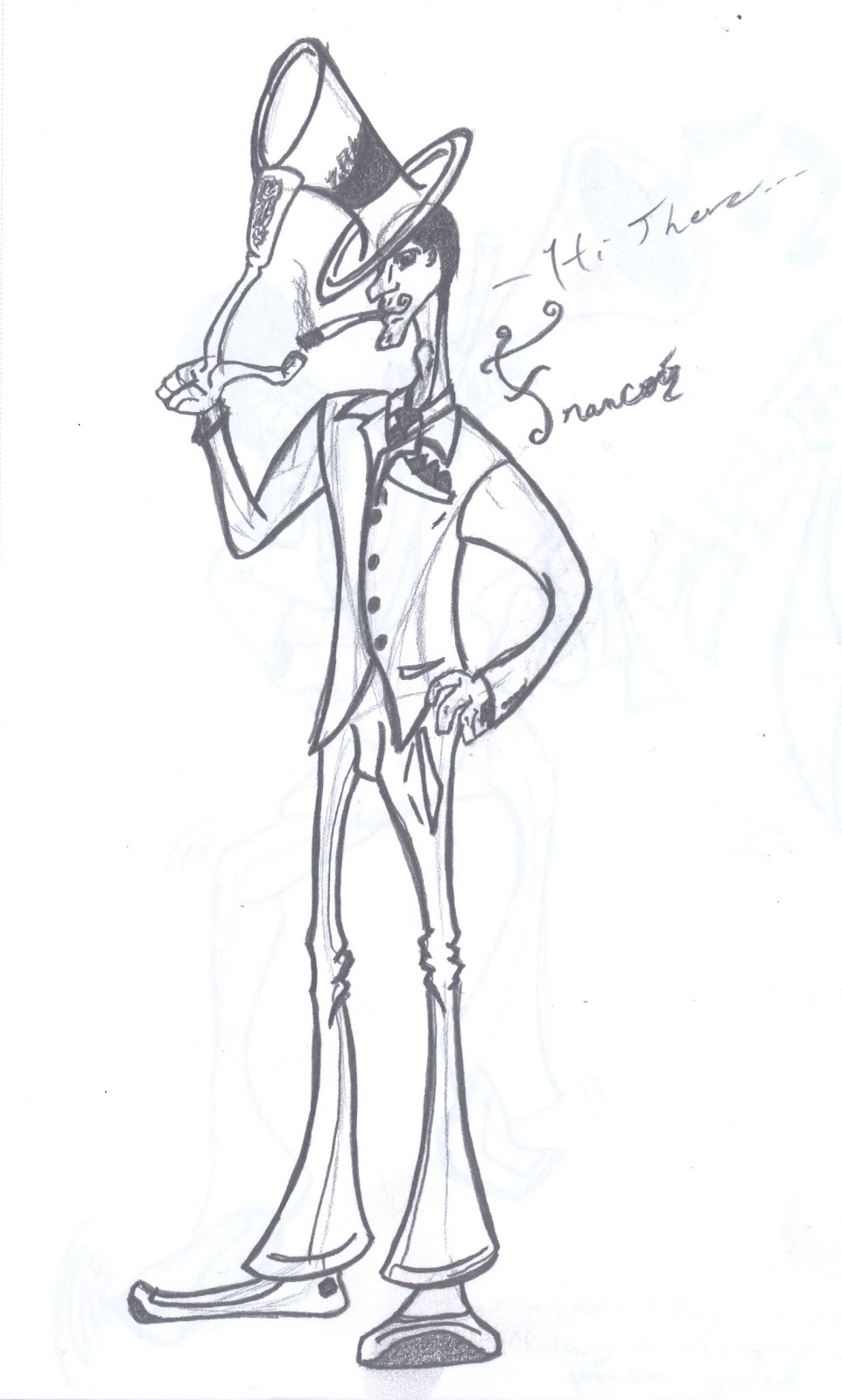
This piece was done while I was passing time in the airport terminal. I was trying to play around and see what other styles I could put out and what would work, and so I put out this. He is a Frenchman, given the name, and I made him, in a sense, that he is sort of like a businessman, but perhaps there is more to him than what is seen...I have been told that he looks like the Shadow Man from Disney's ''The Princess and the Frog'' - I had no intention to make him appear so, but I have no complaints about it.
I was still waiting in the airport terminal when I put this on paper. Some soft jazz music was playing over the speaker system, and I figured I'd go with the mood and put something out coinciding with it. I wanted to do a different style from the previous version, and so I thought of old stylized paintings of musicians and wanted to incorporate a bit of my own style along with it.
Sunday, August 5, 2012
Headless Horseman part 2
This is the final design for my Headless Horseman character; he is the final character for the Halloweenies compilation. Obviously, as with the rest of the cast, he is intentionally quite typical compared to other designs. However, I did want to change up his attitude and make him more emotional than others, hence his Jack O' Lantern having an expressive face; it serves to show two emotions - the saddened expression represents the Horseman's sadness for losing his horse, and the fire represents his anger for losing his head...yes, the Horseman lost his horse. I figured it would serve as an interesting story bit later on down the road when I do individual digital renders and then the group shot. One thing I am unclear of in my own design is how his shoes look similar to modern day sneakers; I really don't care, either-they come off as interesting to see - a long-passed figure wearing sneakers...it's funny. Either way I am happy with how it turned out, and I can honestly say that now, for me, the hard part is to come-digitizing them all and then composing them into one shot. This was done on 5.5X8.5 sketch paper in graphite. Let me know what you all think. Vaya con Dios.
Tuesday, July 17, 2012
Demon part 2
This is the final product of the demon character I created for my Halloweenies compilation I'm currently working on. His final design was intended to be quite simplistic and classic-looking, hence the long horns, spade-tipped tail, and pitchfork. The reason for him facing away from the viewer is to give off a sense about his personality - stubborn, arrogant, and prideful. I thought of him as a demonic prince, and so I figured he would not allow himself to be looked upon by those deemed unworthy, so I faced him away. Although his origins are demonic, I did not intend for him to be inherently evil, but more misunderstood. His pitchfork is also meant to serve more as a symbol of power and status rather than a weapon, which is why I did not make the points longer or sharper than they are. Also, I unintentionally created a ''D'' shape out of his tail and the shaft of his pitchfork; I must admit I like it. This piece was done on 5.5X8.5 sketch paper in graphite. Comment, critique, concerns...leave them here. Vaya con Dios.
Thursday, July 5, 2012
Ghoulies part 2
These are the final ghoulies for the Halloweenies compilation I'm doing. They're design was loosely based on that of typical ghosts - gas-like creatures that are semi-transparent - but with a slight addition of character and personality unique to each. While both are meant to be tricksters, the one with the three head frills and ''beard'' is meant to be more sadistic in his antics, thinking them all to be in good-spirited fun, while the one with one eye leans more towards taunting and jeering. Both share a linkage to one another, but remain separate altogether. Their names are, from left to right, Charlie and Jaunty. They were done in graphite on 5.5X8.5 sketch paper. Post a comment and tell me what you think of them. Vaya con Dios.
Monday, June 4, 2012
Scarecrow part 3
This is the second scarecrow design I came up with. From the style sheets you can see that I wanted to have one with more of an action-feel to it, and thus spawned my oriental scarecrow fighter. This is a little closer to my character styling without going too much into the details. Long story short, the souls of two individuals - an American living in -insert Asian country- and a warrior from -insert Asian country- clashed and merged while traveling the intermediary plane (realm of the dead) and entered an old scarecrow. Due to the clashing of souls, and therefore cultures and everything else that makes a person who they are, the scarecrow reformed itself to accommodate both. Some design notes - one hand is a scythe and one eye is stitched shut due to the warrior's battle scars. The pattern on some of the clothing is meant to be pleated to show a bit of Americana; same goes for the patchwork and stitching. This was done on 5.5X8.5 sketch paper in graphite. Comment and let me know what you think. Vaya con Dios.
Monday, May 28, 2012
Scarecrow part 2
This is the first final scarecrow design I did and the same one I'm going to use for a compilation I'm putting together called The Halloweenies. My inspiration for this design was loosely based on the generic stick figure ideology, and the style was meant to be a combination of the DC Universe animation and my own style, all while holding a bit of a sense of a Burtonesque feel to it as well. The scythe was made big so as to offer a slight balance between thin and thick; also, although it was unintentional, the handle and blade combined seem to make an ''S'' shape, so it works out for me. The raven atop the scythe is meant to serve as a familiar - I figured that if a scarecrow is meant to scare crows away, why not have one that isn't afraid and instead becomes the scarecrow's pall. His gesture will be explained when the final compilation is put together and posted. This was done on 5.5X8.5 sketch paper in standard graphite. Please post any and all comments. Vaya con Dios.
Wednesday, April 4, 2012
Character Design
A character I created for my character design class; his name is Malik - M. Ali K -- first letter of my last name. I decided to break my comfort zone of more detailed and realistic pieces by doing him in a more stylized/cartoony style all while still maintaining a certain reality to it. Unfortunately I never came up with a backstory for him-leave a comment if you think I should make one or if you have a suggestion. This was done on 9X12 smooth Bristol board in standard graphite pencil. Vaya con Dios.
Subscribe to:
Posts (Atom)


